(2021) Vancouver Bird playing Cards
Description
When the COVID-19 lockdown started in March of 2020, my office closed down and I started working from home. Sadly, my daily walk to and from work was the primary way I got exercise each day. In the first few weeks I rarely left the house and the lack of daily exercise, being cooped up inside the same room every day, and the general stress of COVID was causing me to experience a large amount of anxiety.
My partner, Lori, suggested that we start an outdoor activity to get through COVID. We decided to go to all the ~250 parks in Vancouver, and take a selfie in front of every park sign in the city. That project got me out of the house, gave me some exercise, and greatly improved my mood. It gave us something to look forward to most days and a reason to leave the house. We finished the Vancouver parks project in 7 months on December 19th of 2020.
Lori and I started birding as a second ‘covid project’ after that in January 2021 as this also became a great reason to leave the house. It quickly became one of my favorite hobbies. Birding really speaks to my trend of “gotta catch them all” style projects, similar to my 2020 Vancouver parks project. It’s like a giant hunt and seek puzzle!
There are approximately ~270 different species of birds that are found in Vancouver. Some on them migration north or south and others that call Vancouver home year around. 75 of them are common while the rest are rarer to see. Plenty of birds species to make a deck of 52 cards +2 jokers
We quickly started amassing a number of good bird photos and thus a hunt for a 3rd project was born to use those photos in! We decided to make a deck of playing cards where the face of each card would have a different species of bird from our photo collection.
It took 76 days (February - April) to collect 52 print-quality photos of different species for the deck of cards. During this time we took 17,190 photos, of 93 species, over 960 observations. That’s approximately ~220 photos, and ~12 different species a day. We used a Sigma 150-600mm f/5-6.3 DG OS HSM Contemporary Lens with a Sony A6400 camera body which I think really worked well.
I have been uploading photos of the birds to a project on iNaturalist. It also has a running tally of the different species of birds I photographed so far. I have been posting the best photos on my Instagram feed (@funvill. Follow me to keep up to date with this project.
Birds
| Suite/Rank | BirdName | Wingspan | Sex | My photos 📷 |
|---|---|---|---|---|
| ♥ Ace | Anna’s Hummingbird | 10 - 12 cm | ♂️ | 📷 |
| ♥ 2 | Golden-Crowned Kinglet | 14 - 18 cm | ♂️ | 📷 |
| ♥ 3 | Black-Capped Chickadee | 15 - 20 cm | ⚥ | 📷 |
| ♥ 4 | Ruby Crowned Kinglet | 16 - 18 cm | ♀️ | 📷 |
| ♥ 5 | Pine Siskin | 18 - 22 cm | ⚥ | 📷 |
| ♥ 6 | Dark-eyed Junco | 18 - 25 cm | ⚥ | 📷 |
| ♥ 7 | Song Sparrow | 18 - 26 cm | ⚥ | 📷 |
| ♥ 8 | House Finch | 20 - 25 cm | ♂️ | 📷 |
| ♥ 9 | White-Crowned Sparrow | 21 - 24 cm | ⚥ | 📷 |
| ♥ 10 | Spotted Towhee | 27 - 29 cm | ⚥ | 📷 |
| ♥ Jack | Red-Winged Blackbird | 31 - 40 cm | ♂️ | 📷 |
| ♥ Queen | American Robin | 31 - 41 cm | ⚥ | 📷 |
| ♥ King | Varied Thrush | 34 - 42 cm | ⚥ | 📷 |
| ♠ Ace | Downy Woodpecker | 25 - 31 cm | ♂️ | 📷 |
| ♠ 2 | Red Crossbill | 30 - 35 cm | ♀️ | 📷 |
| ♠ 3 | Tree Swallows | 31 - 35 cm | ♀️ | 📷 |
| ♠ 4 | European Starling | 32 - 44 cm | ⚥ | 📷 |
| ♠ 5 | Red-Breasted Sapsuckers | 35 - 40 cm | ⚥ | 📷 |
| ♠ 6 | Red-Naped Sapsucker | 41 - 43 cm | ♂️ | 📷 |
| ♠ 7 | Northern Flicker | 42 - 54 cm | ♂️ | 📷 |
| ♠ 8 | Cooper’s Hawk | 62 - 99 cm | ⚥ | 📷 |
| ♠ 9 | Pileated Woodpecker | 66 - 75 cm | ♀️ | 📷 |
| ♠ 10 | American Crow | 85 - 100 cm | ⚥ | 📷 |
| ♠ Jack | Northern Harrier | 97 - 122 cm | ♀️ | 📷 |
| ♠ Queen | Red-Tailed Hawk | 105 - 141 cm | ⚥ | 📷 |
| ♠ King | Bald Eagle | 180 - 230 cm | ⚥ | 📷 |
| ♦ Ace | Pied-Billed Grebe | 45 - 62 cm | ⚥ | 📷 |
| ♦ 2 | Short-Billed Dowitcher | 46 - 56 cm | ⚥ | 📷 |
| ♦ 3 | Belted Kingfisher | 48 - 58 cm | ♀️ | 📷 |
| ♦ 4 | Greater Yellowlegs | 55 - 60 cm | ⚥ | 📷 |
| ♦ 5 | Northern Shoveler | 70 - 76 cm | ♂️ | 📷 |
| ♦ 6 | Black Oystercatcher | 81 - 88 cm | ⚥ | 📷 |
| ♦ 7 | American-Bittern | 92 – 115 cm | ⚥ | 📷 |
| ♦ 8 | Pelagic Cormorant | 100 - 120 cm | ⚥ | 📷 |
| ♦ 9 | Double-Crested Cormorant | 114 - 123 cm | ⚥ | 📷 |
| ♦ 10 | Glaucous-Winged Gull | 120 - 150 cm | ⚥ | 📷 |
| ♦ Jack | Canada Goose | 127 - 185 cm | ⚥ | 📷 |
| ♦ Queen | Great Blue Heron | 167 - 200 cm | ⚥ | 📷 |
| ♦ King | Sandhill Crane | 170 - 230 cm | ⚥ | 📷 |
| ♣ Ace | Bufflehead | 53 - 60 cm | ♀️ | 📷 |
| ♣ 2 | Green-Winged Teal | 54 - 59 cm | ♂️♀️ | 📷 |
| ♣ 3 | American Coot | 58 - 71 cm | ⚥ | 📷 |
| ♣ 4 | Hooded Merganser | 60 - 66 cm | ♂️ | 📷 |
| ♣ 5 | Ring-Necked Duck | 62 - 63 cm | ♂️ | 📷 |
| ♣ 6 | Mandarin Duck | 65 - 75 cm | ♂️ | 📷 |
| ♣ 7 | Wood Duck | 66 - 73 cm | ♂️♀️ | 📷 |
| ♣ 8 | Lesser Scaup | 68 – 78 cm | ♂️ | 📷 |
| ♣ 9 | Barrow’s Goldeneye | 70 - 73 cm | ♀️ | 📷 |
| ♣ 10 | Common Meganser | 70 - 86 cm | ♀️ | 📷 |
| ♣ Jack | American Wigeon | 76 - 91 cm | ♂️ | 📷 |
| ♣ Queen | Gadwall | 78 - 90 cm | ♂️ | 📷 |
| ♣ King | Northern Pintail | 80 - 95 cm | ♂️ | 📷 |
| Red Joker | Lori Schlechtleitner | 165 cm | ♀️ | |
| Black Joker | Steven Smethurst | 168 cm | ♂️ |
Photographing birds
It took me 76 days (February - April) to collect 52 print-quality photos of different species for the deck of cards. During this time I took 17,190 photos, of 93 species, over 960 observations. That’s approximately ~220 photos a day of ~12 different species.
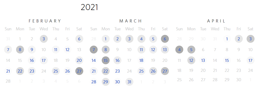
From the calendar, you can see that took most of my photos on the weekends when I visited bird sanctuary and other specific bird locations.
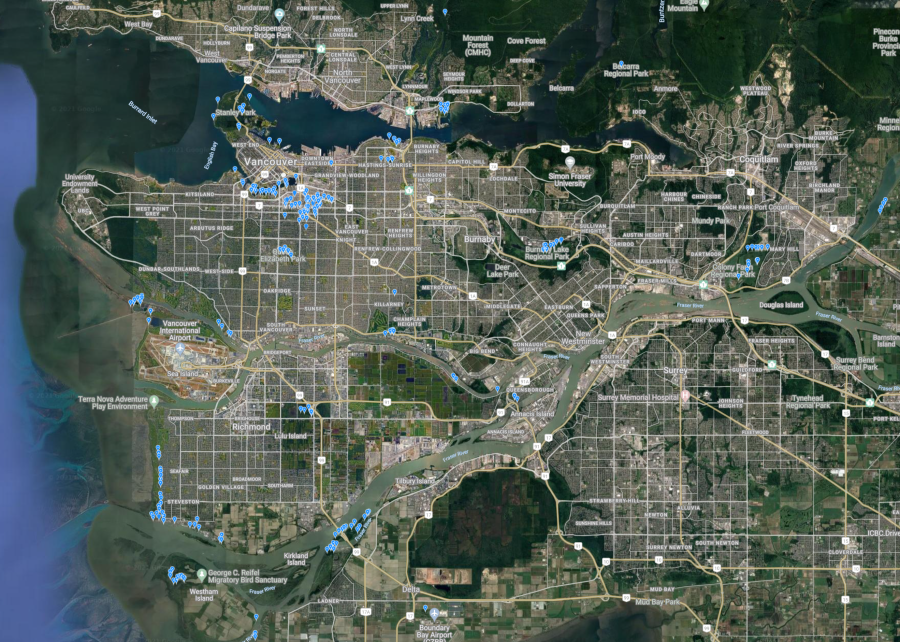
This is a map of locations that took photos of birds. Most of the photos that I took were located in Mount pleasant in Vancouver near my house and bird sanctuary. Maplewood Flats, Colony Farm Regional Park, Deas Island Regional Park, West Dyke Trail, Iona Beach Regional Park, Reifel Migratory Bird Sanctuary, Richmond Nature Park, Burnaby Lake
My top ten most photographed birds: Song Sparrow, American Crow, American Robin, Bald Eagle, Black-capped Chickadee, Northern Flicker, Anna’s Hummingbird, House Finch, Mallard, Great Blue Heron
This list not surprisingly matches up with top bird species in Vancouver, observed on iNatural
Most of my best photos can be found on my instagram page.
- Red-naped Sapsucker, and a Red-breasted Sapsucker
- Lots of ‘red headed’ house finch down at the river district
- Bakers dozen or downy woodpecker at south arm park
- White-winged crossbill
- Birds staring me down
- My first trip to Rifel bird sanctuary. We got 35 species including Sand hill cranes, dozens of herons, Northern shovelers, red wing black birds, American coots, and white faced goose,among many others
- Downy woodpecker
- Golden crowned Kinglet. He is searching for insect eggs in the moss on a tree
- Cooper’s hawk, Northern harrier, red tailed Hawk, house finch, and a bunch of northern Flicker
- Playing with crows
- Smooth backgrounds
- Great blue heron in flight jumping between rocks
- Cloudy rainy day at Fraser River Park, got a few good shots of birds playing in the rain
- Snowy day at Maplewood flats conservation area. Found a Cooper’s hawk, dozens of friendly spotted towhee, and a few hungry birds
- Northern Flicker sticking his tongue out and eating some bugs
- Hooded Merganser flying away with a fish.
- Juvenile baled eagles learning to hunt ducks at crescent Beach
- Northern Flicker, American Robin, hooded Merganser, Barrow’s Goldeneye
- Pelagic Cormorants catching a fish and a crab
- American Robin’s and American wigeon
- Belted kingfishers, Eagles, blue herons, hooded merganser, American dipper, bufflehead
Design
I decided to order the birds in each suite by the size of their wingspan. The larger the bird the higher the face value of the card. Anna’s hummingbird with a wingspan of 12 cm is one of the smallest birds that would have a face value of 1 (Ace). While a Sandhill crane with a large wingspan of 201 cm would have a face value of 12 (Queen)
I also wanted to organize the type of bird by their suites.
- ♥ Hearts for songbirds: Annas Hummingbirds, Dark-eyed Junco, Spotted Towhee
- ♣ Clubs for waterbirds: Hooded Merganser, Wood Duck, Northern Shoveler
- ♦ Diamonds for shoreline birds: Black Oystercatcher, Pied-billed grebe, Pelagic cormorant
- ♠ Spades for raptors and oddballs: Northern Harrier, Great Blue Heron, Cooper’s Hawk.
Some birds tend to have several names depending on where you are. The Canada jay, also known as the gray jay, grey jay, camp robber, or whisky jack. Using the Latin name (Perisoreus canadensis) helps reduce the confusion on what bird is what. But it’s not useful to the average person. I decided to leave out the Latin name of the bird as it won’t help with identifying the birds.
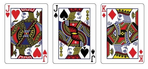
One-eyed royals is referring to Jack of Spades (J♠), Jack of Hearts (J♥), and King of Diamonds (K♦) that traditionally only have one eye visible. This tradition is used in some game rules. For example, it is common to play poker with “One-eyed jacks are wild”. I want to keep this tradition in the bird deck so I specifically choose photos for the Jacks that followed this rule.
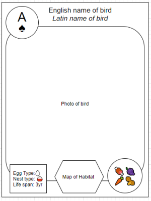
Traditionally the suite and the value of the card are shown in the top left and upside down in the bottom right of the cards. This allows the cards to be orientated in both directions. The duplication of the suite /value does take up more space on the card but I felt that it was a better design and worth the real-estate on the card.
Card Layout
I spent a lot of time trying out many different layouts of cards. I am no designer but I wanted to see what I could do before passing it off on to a professional.
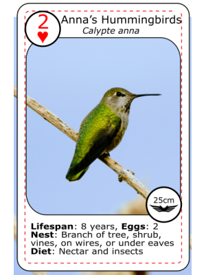
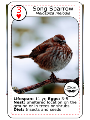
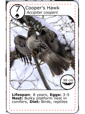
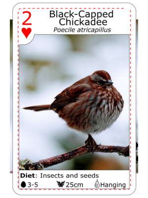
Printing companies
Before starting this project I did my research to find out what everyone else was using for their printers. After reviewing dozens of playing cards projects on Kickstarter and contacting their creators I decided to go with Make Playing Cards (MCP). MCP was recommended by several Kickstarter creators, they did small runs of less than 50x, no set-up charge, and their prices were reasonable in quantity, supported full-color photos, and lots of different options to choose from.
I didn’t realize that they were shipping from China. My proofs took 4 weeks to ship to my door. The shipping costs were relatively expensive compared to the costs of the decks of cards. If I knew it was going to take that long I would have printed several different variants of the cards for proofs.
Pricing for Custom poker size cards quanity: 1-5 ($13.90 USD), 50-99 ($7.95 USD), 100-249 ($6.35 USD)
I am planning on printing around 60 decks of cards. It should cost around $500 + shipping.
Version 1
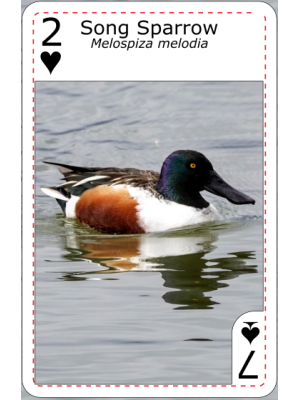
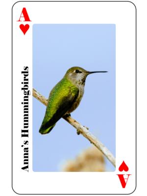
This is the first version of the hearts suit. I wanted to get something on paper to be able to solicit feedback early from my peer group before making more iterations.
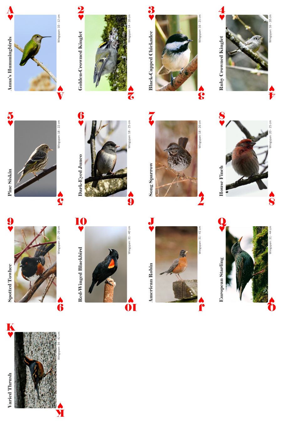
This is some of the feedback and issues I see with this version.
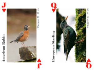 Horizontal rotation - This was the main criticism of this design. I wasn’t thinking of the orientation when I was taking photos of the birds. Some of my best photos are originated horizontal instead of vertical. Most waterbirds (ducks) are on the water are orientated horizontally. If I try to put them in a vertical photo the background will take up most of the space of the photo. The bird will look physically small. I am still trying to figure out what to do here.
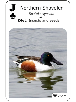
Size of the photo frame - The frame for the photo is just the amount of space that was available on the card. I didn’t give it much thought about the ratio of the photo frame. It’s not 3x4 or the golden ratio or any other magic designer ratio. it feels too tall for the card and I might change the frame to be more traditional sized.
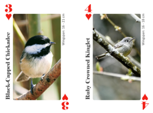 Scaling of birds - The scale of the birds in 3♥, Q♥ looks odd compared to the rest of the suit because the bird is so much bigger in the frame than the rest of the photos. I think this problem only really an issue when all the cards are laid out on a single sheet. When playing with the cards I don’t think this will be an issue. Either way, in the next iteration I will try to get all the birds to take up the same amount of space in the frame as possible.
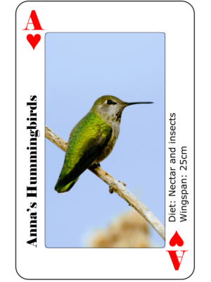
Additional information - In this version, I removed the Latin name, diet, and other information about the bird from the cards. I did this to reduce the noise from the card but it sounds like many people liked the extra context.
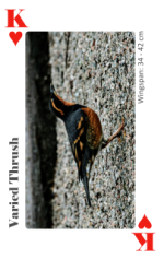 ♥ King - I used a photo of a Varied Thrush for the king. The issue with this photo is that the background isn’t blurred out or a solid color. This makes the bird look darker than it is. I need to find a better photo of this bird.
Jokers - It was suggested that the jokers with fictional birds or extinct birds. The theme of these cards is photos of birds that I took while in Vancouver. Fictional birds or extinct birds are much harder to take photos of. The plan is to use photos of me and my partner with common birds on our heads. I have a photo of a red-wing blackbird on my head for the red joker and a chickadee on my partner’s head for the black joker.
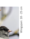 Wingspan font - I wanted the wingspan font to be smaller and different from the bird name font. I don’t like how gray it turned out when looking at the print preview. I think I need to try out a few different iterations.
 10 - The only double-digit number in the set. While I like the font the extra space that the 10 takes up edges dangerously close to the “Safe area” where it could be cut off during manufacturing. I think this is one of though things where I need to get a proof printed to see what it looks like before I make the large order.
Wingspan and bird size - The only information besides the bird name on the cards is the wingspan range. I left this information on the card to give some context to the order that I arranged the cards. Smallest to largest wingspan in a suite. It was suggested that I should either remove this or show iconography for the size of the bird instead. Maybe even include a banana for scale. Very small, Small, Banana size, Large, Larger, Very large
Version 2
After reviewing the advice I got form Version 1, I added all the bird photos to the latest design.
A few of the photos I took were unusable in a vertical orientation and I had to remove them. I am hoping to find these birds again and take new photos. Missing birds are in yellow.
I have printed this version out and found a few issues that I will need to fix in the next version.

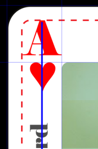 Suite, Rank, Birdname Alignment - The suite and rank were designed in a single font object, but the font that I selected wasn’t fixed width and the rank are sometimes oddly shaped. When I aligned the suite and rank it caused the suite to sometimes be slightly (10px) off center.
I aligned the bird name text off the first card that I designed “A♥” then updated the text on all the other cards without realigning the text. Because of the odd shape of the “A” on the first card it caused some weird issues on all the other cards making the font look off center.
It’s a minor detail but is very visible when you print the cards out.
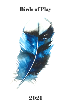 Back of the cards - I wanted something simple and iconic for the back of the cards. Another photo of a bird was too “busy” for me. I didn’t want to choose a single bird species as it would elevate that species above all the other birds.
I decided to use a feather as its iconic of birds without being too specific to one species over another.
For the style of the feather, I wanted something more artistic and creative. A blown acrylic flower, acrylic pour, drawn ink, pencil, ink, block print, spraypaint stencil, watercolors, stained glass, etc…
After playing around with a bunch of different designs I decided to use a watercolor feather. The watercolor would add softness to the background that I hope is appealing.
My partner and I tried doing it ourselves first and spent a few nights playing around with watercolors. It was a fun experiment but I wasn’t happy with the results.
I found a few stock photo websites that had suitable watercolor feathers but they didn’t have a story associated with the painting, that the photos on the face of the cards did. Instead of using stock images, I made a call-out on my social networks looking for watercolor artists that had experience with nature and birds. I got 20 responses quickly and was able to find a person that I was happy with.
I worked with Sal Beck to design a feather design that I liked. She even sent me the original painting. I like that this painting has a story, it adds some flavor to the whole project.
Version 2.6 (Printed)
I got my first print of the deck of cards using version 2.6 and they turned out okay. A bunch of things immediately jumped out to me.
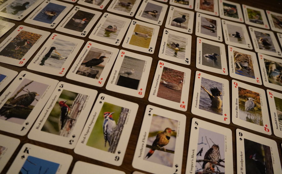
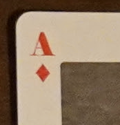 The suite and rank are too small - The suite symbol could be at least 40% larger. it looks dwarfed compared to the rank.
Use black for the bird name - I used a gray color font for the bird name text. It looked good on my screen but looks terrible when on the printed cards. I should have just used straight black.
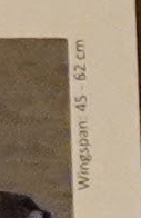 The “wingspan” font is far too small - The font is too small and the font is too light. It made it hard to read.
Border around the suite and rank - I printed the joker with a very small black border around the red text and it turned out great. I think it would look good around the red suit and rank.
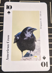 Add a black border around the photo - Similar to the border around the red suit and rank, I think a black 1mm border around the photo of the bird would look good.
The cards are smaller than normal cards - I used “poker” size cards and didn’t realize that they are slightly smaller than regular playing cards. “Casino” size cards are the “normal” size cards. Redesigning the cards for a new template will be a lot of work, but being able to use this deck with another deck seems important.
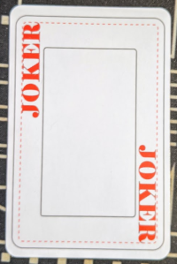 Too much white space in the margins - There is too much white space above and below the bird photo. I either need to increase the size of the bird photo or put something in these margins.
Glossy finish - In this version, I used a normal matted finish, I should have used a glossy finish it would have made the photos pop.
The template did not match the actual cut cards - This was disappointing to find out. The template provided didn’t match what I was expecting.
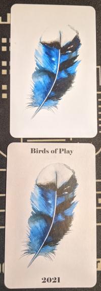 The back of the card looks washed out - I lighten the image for the back of the cards to make the background white. I also printed a version without the brightened-up background that looked a lot better.
Changes to specific cards - A few of the specific cards had some issues.
- ♥3 Black-capped Chickadee - Bird is too high in the photo.
- ♠6 Red-naped Sapsucker - The photo is dull and blurry.
- ♠Q Red-tailed Hawk - Background is too busy.
- ♦5 Northern Shoveler - Bird is squashed into the frame.
- ♦8 Double-breasted Cormorant - Tail is cut off, the bird is squashed into the frame.
- ♦9 Olympic Gull - Bird disappears into the similar color background.
- ♦10 White-fronted Goose - Bird is squashed into the frame.
- ♦J Canada Goose - Wing is cut off.
- ♣4 Hooded Merganser - Nose and tail are cut off.
- ♣Q Gladwell - Bird is small in the photo.
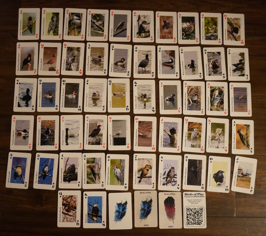
Version 2.7 (Printed)
Changes in this version after reviewing the printed 2.6 version.
- Increased the size of the suite ♥♣♦♠
- Use black color for the font of the Bird name
- Black border around the suite and rank
- Red font for the bird name on red cards
- Black boarder around the photo
- Increased the card size to match a “casino” size
- Reduced the margin size around the photo
- Used a textured background for the cards
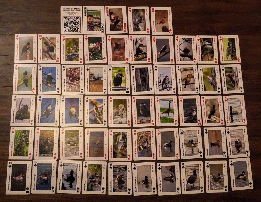
- Updated QR Code info card with version number
- Moved Bufflehead from ♣2 to ♣1
- Moved Green-Winged-Teal from ♣1 to ♣2
- Changed bird species ♦10 to American Bitterns
- Changed photo for ♥4 Ruby Crowned Kinglet
- Changed photo for ♠10 American Crow
- Changed photo for ♦8 Double Crested Cormorant
- Changed photo for ♦Jack Canada Goose
- Changed photo for ♣7 Wood Duck
- Changed photo for ♣Queen Gadwall
- Changed photo for ♦9 Glaucous Winged Gull to one where he eating a starfish
- Fixed mistaken ID, changed ♦2 Long-Billed-Dowitcher to short-Billed-Dowitcher (Thanks Lori)
- Fixed mistaken ID, changed ♣10 Red-breasted Merganser to Common Merganser (Thanks Lori)
- Fixed mistaken ID, changed ♦9 Olympic Gull to Glaucous Winged Gull (Thanks Lori)

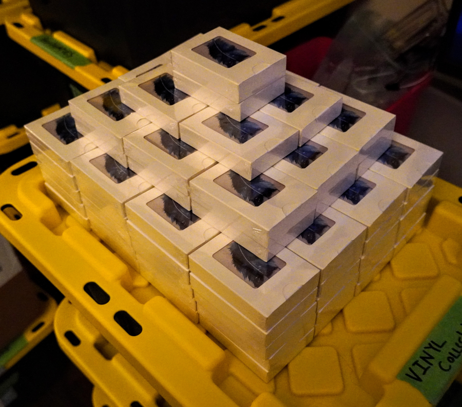
Printed
Cost
Below are a break down of the costs of this project.
Printing
- Printing Version 2.6 test version (Qty: 1x)
- Subtotal: $14.69 USD
- Shipping: $9.99 USD
- Order Total: $24.68 USD ($30.43 CAD)
- Printing Version 2.7 (Qty: 120x)
- Subtotal: $786.00 USD
- Shipping: $114.09 USD
- Duites and taxes: $91.53 CAD
- Order Total: $1,201.21 CAD
Total: $1,231.64 CAD
Shipping
Each deck weights 120g. I am planning on using Canada post to ship the decks of cards as small letter
- $3.19 CAD to ship a deck of cards to anywhere in Canada. I expect to ship 50 decks of cards
- $5.57 CAD to ship a deck of cards to anywhere in USD. I expect to ship 20 decks of cards
- $11.14 CAD to ship a deck of cards to anywhere in International. I expect to ship 10 decks of cards
Plus the cost of shipping supplies $25 CAD
Total
- Printing total: $1,231.64 CAD
- Shipping costs: $400.80 CAD
- Grand total: $1,632.44 CAD
Cost per deck of cards: $13.60 CAD
